Inbound marketing is all the rage these days. Rather than use promotional methods that interrupt a consumer’s life, businesses are realizing the value in letting consumers come to them.
One of the most important components of this new marketing strategy is the landing page.
What is a Landing Page?
Inbound marketing is centered around the idea that today’s consumers are in want of information.
They often go online searching for knowledge before they even know they have a problem to solve. Once they realize they have a problem, they search for a solution. Then, they evaluate which solution is best.
This progression is called the buyer’s journey. Consumers progress through three stages: Awareness > Consideration > Decision. Consumers progress through three stages: Awareness > Consideration > Decision. Share on X
Inbound marketers are capitalizing on this progression by providing the knowledge consumers want in hopes that they’ll progress through the entire buyer’s journey with them.
By capturing contact information and turning visitors into leads, merchants can more easily move potential customers further down the conversion funnel. Using WordPress? Check out my hand-picked list of plugins.
This is where landing pages come into play.
Unbounce defines a landing page as, “a standalone web page that has been designed for a single focused objective.”
For inbound marketing to work, it is crucial to have high-converting landing pages. After content, the design is the most impactful element of a successful landing page.
Here’s what you need to know about high-converting landing page designs.
1. Understand Who You Are Designing For
Remember the purpose of inbound marketing–to provide the information the visitor is looking for.
Unlike traditional advertising, a landing page doesn’t necessarily need to capture the visitor’s attention. It’s not an ad in a magazine that is fighting to catch the reader’s eye amongst hundreds of other flashy messages.
Rather, a landing page needs to make the information a visitor craves easily digestible–and make it obvious what step they need to take to gain the next piece of information.
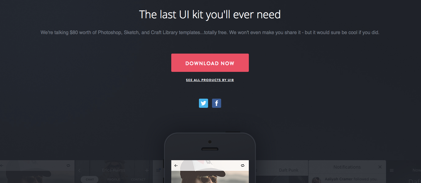
2. Keep It Simple
The inbound marketing methodology means simple is usually best.
Use a simple layout that doesn’t distract from what the visitor is supposed to do next. Check this example from Tethr.
3. Optimize the CTA Button
Speaking of not distracting the visitor from the desired action, carefully consider the design and placement of your CTA button. Carefully consider the design and placement of your CTA button. Share on X
- The CTA button should be a contrasting color from everything else that’s happening on the page. It should be the most obvious, eye-catching element on the page.
- Use action words so they don’t have to guess about what comes next–Download, Sign Up, and Start Now are good options.
- Experiment with placement. Oldschool marketers will say the majority of the content–and certainly the CTA–needs to be above the scroll. Other experts say it isn’t that important. Do A/B testing to see what is best for your offer.
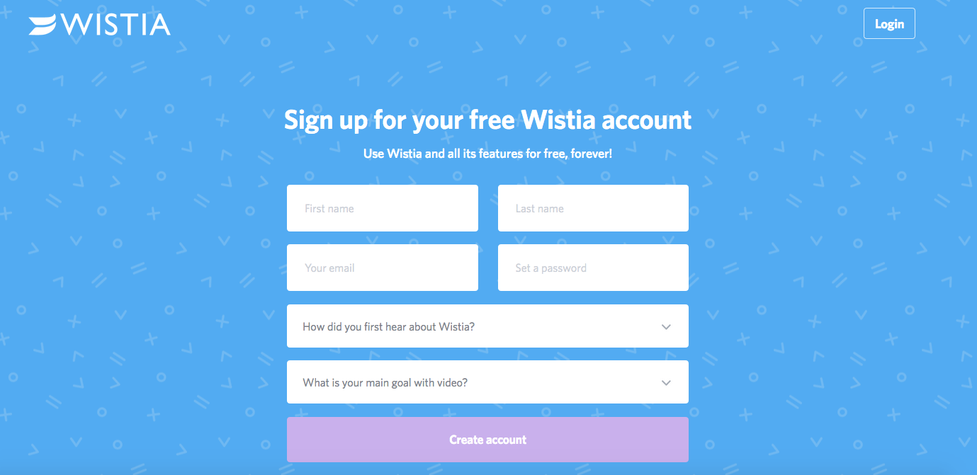
4. Include Your Logo
Visitors often arrive at a landing page from somewhere else. Make it obvious where they are and who is helping them. Check this example from Wistia.
5. Use Bold Headings and Subheadings
Consumers have a very short online attention span. Don’t make they work harder than they want to.
Start with a bold heading that explains the action you want them to take–Download, Buy, Watch, etc. Follow it up with a descriptive subheading that highlights the benefits of the offer.
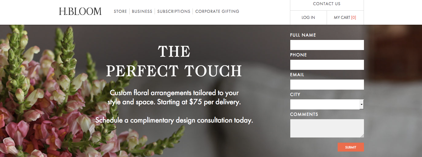
6. Use Images or Videos
While it is beneficial to have a clean, uncluttered layout, it can also be helpful to include an image or video that helps visitors visualize what it is they’ll receive.
Check an example from H.Bloom.
7. Add Social Share Buttons
You’ve worked hard to create something beautiful–you should share it with as many people as possible! Plus, the more people who see your landing page, the greater the chance of obtaining leads. You’ve worked hard to create something beautiful--you should share it with as many people as possible! Share on X
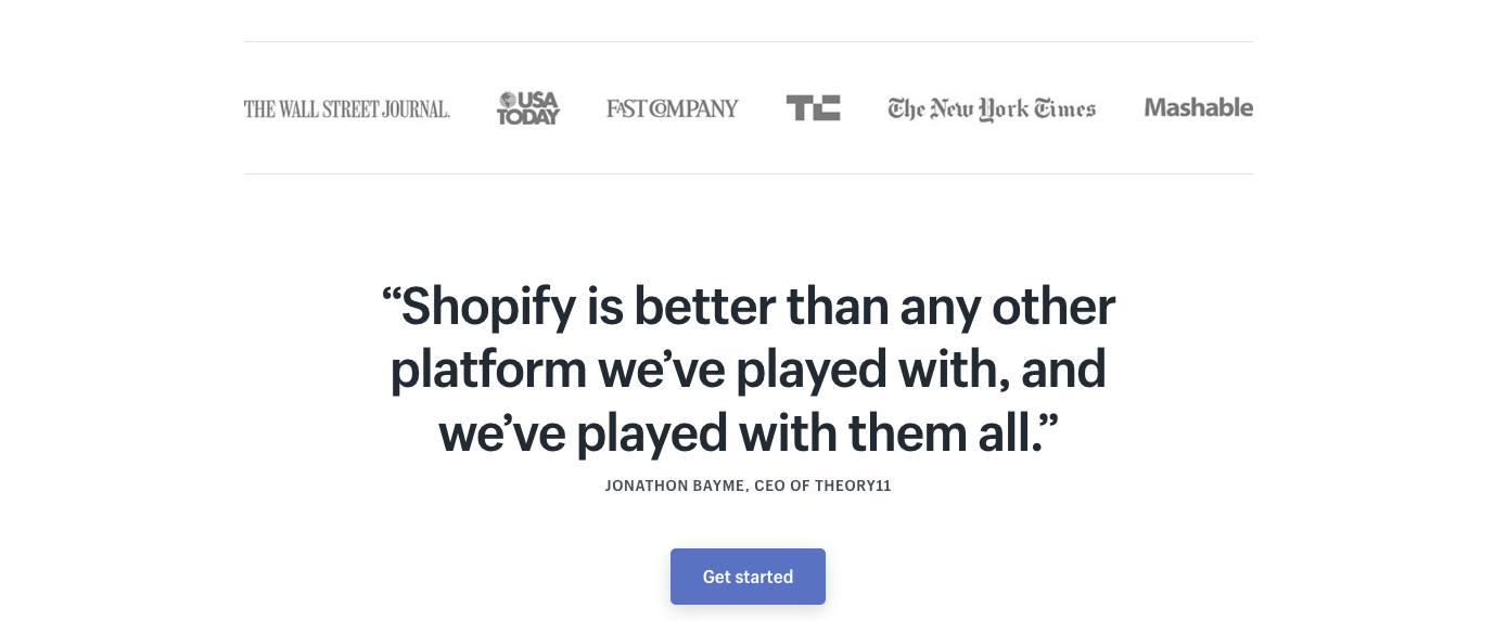
8. Include Social Proof
No one likes to be the first to a party. Show visitors someone has gone before them and was satisfied with the results.
Examples of social proof include client testimonials, press mentions, guarantees, certificates, or any other third-party endorsement.
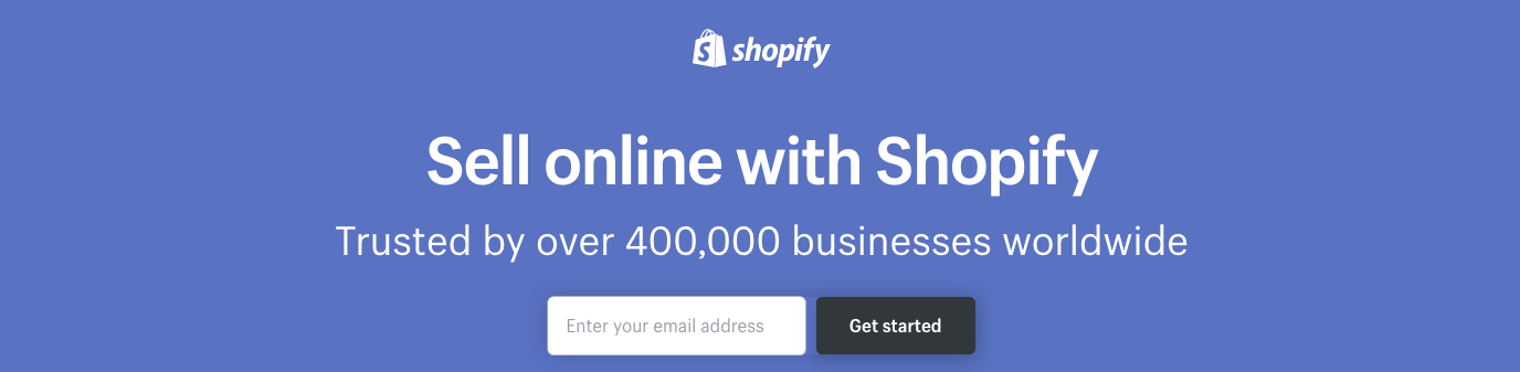
Shopify highlights how many clients they serve…
…and shares press mentions and testimonials.
9. Test Everything
Once your design is “done,” you should rip it apart and start over. Ok, not actually, but you shouldn’t ever consider a landing page to be finished–there is always room for improvement.
Change an element and test the outcome. When you determine the winner, tweak something else and test again.
Just remember…you should only make one change at a time. Otherwise, you won’t know which change generated the improved results.
Landing Pages: The Design Project of the Future
Inbound marketing has proven to be the most effective way to generate sales in today’s technology-driven world. That means, landing pages will be an ongoing design request for the foreseeable future.
Accept the fact that you may very well be designing little more than landing pages and learn to optimize the process for optimal results.