
Responsive web design is the most talked about feature of website development right now. Creating one main design that consistently bends and flexes to fit within a myriad of devices is the main goal. The key is consistency. Creating a responsive design doesn’t have to be hard. There are tons of great tools and frameworks out there to make life easy for you. Below are a list of tools to simply the responsive web design process.
Columnal
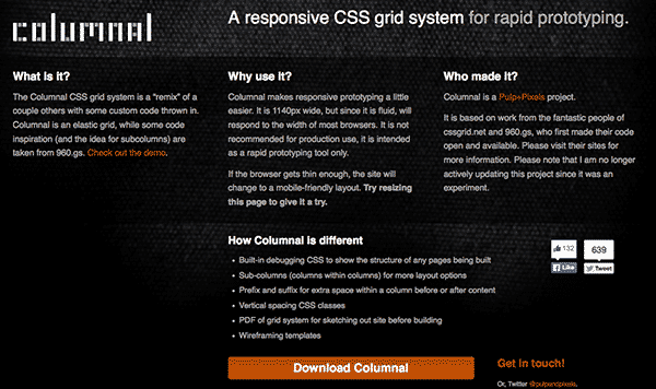
Columnal is the Pulp+Pixels project taken from the cssgrid.net. And the code inspirations have been borrowed from the 960.gs. The importance of the Columnal is that it goes a long way in helping you to design your responsive web design. It makes possible it through making the grids flexible. And thus it becomes possible for you to change it as and when window of the browser is resized.
Skeleton
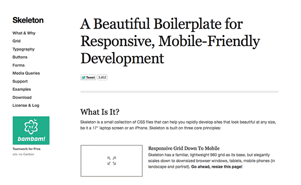
Skeleton is known to be an effective CSS framework for its simplicity and effectiveness and helps in effective and professional documentation with the CSS
Less Framework

Less Framework is an essential adaptive grid system of CSS. In fact it has its thrust on the inline CSS media queries. And thus the designing and development of the responsive web sites becomes more appealing and easier for that matter.
Semantic Grid System
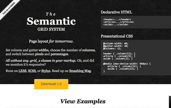
Semantic Grid System has its thrust on grid layouts that are responsive. It achieves efficiency through CSS extensions like LESS, stylus, SCSS and thus gain utmost efficiency. Here you have the total freedom to select gutter widths, number of stipulated columns, and you can even change between percentages and pixels.
The Golden Grid System
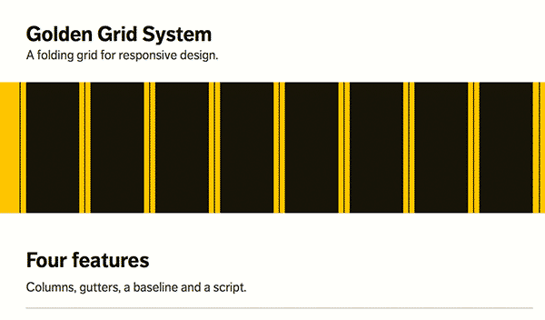
The Golden Grid System is primarily designed as a fluid grid format and it can be counted as a starting point for your responsive web formatting. With its help you can go for nice looking and appealing pages ranging from 240 to 2560px.
Rock Hammer
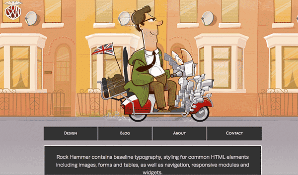
Rock Hammer serves as the starting template for responsive web designing. It is a CSS media queries boilerplate as well.
Inuit CSS
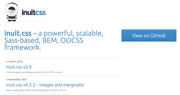
Inuit.css which is easy to use and even the beginners can use it very easily for that matter. The point is that you can minimize your actions to the relevant points and if need you can extend it to the available plug ins. It is easy to use for the novices even.
Gridless
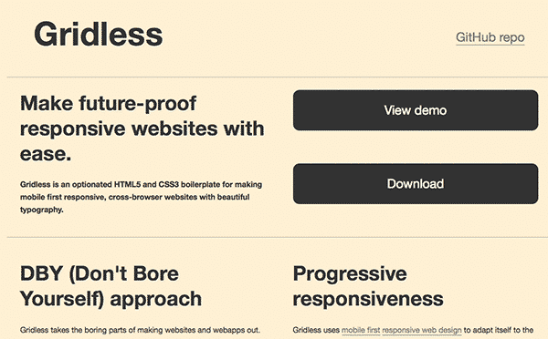
Gridless helps you to create mesmerizing and appealing web sites using good topography. The tool which can serve as a starting point for your web designing and it is essentially thrusts on project and its subsequent development.
Bootstrap
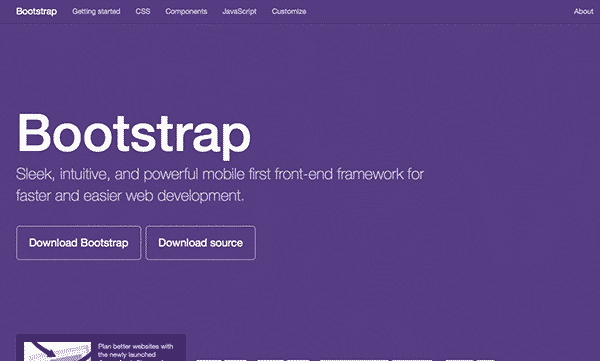
Bootstrap is another great framework for rapid, responsive web design and development. Highly customizable, and packed with tons of extras, Bootstrap makes it easy to develop sophisticated, cross browser compliant websites that are professional and beautiful.
Foundation
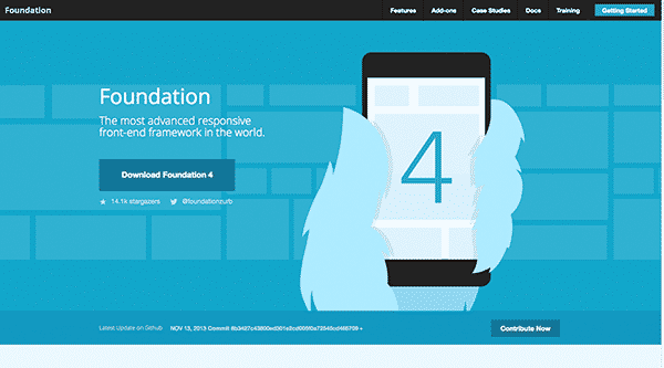
Created by Zurb and my personal favorite as of right now, Foundation is an amazing framework for rapid web development. I can structure and create a site quicker than ever before. The best part about Foundation is that I can include all of the features that I need, and none of the ones that I don’t. I love how easy it is to implement extra features, such as sliders, and other javascript add-ons to create a truly amazing website.
Which one is your favorite framework for responsive web design?
I told you mine. Foundation wins, hands down. What about you? Everyone loves their own personal framework. It really just boils down to what makes the work easiest for you. It doesn’t really matter, as long as you create something great.