Logo Design Tips
Logo design might seem like a simple task, but a lot goes into the process of designing and developing a logo. A logo has to inform everyone of a business and what it does. It also needs to be streamlined, so that it is easy to read and understand. It also has to be memorable and have staying power. Below are some tips to consider when designing a professional logo.
Logo Design Requires Some Research
You can’t just jump into a logo design and start moving around vectors and pixels. You need to look at the business, its competition, and what they are doing. You need to assess the industry as a whole, so you can figure out how to make the clients business stand out with their logo. You need to do some research and determine who the target audience is, and who your client’s business caters to. Your target audience will be who the company is likely to succeed in marketing to. The main goal of any business is sales and growth.
The Goal is to Be Beautiful & Unique
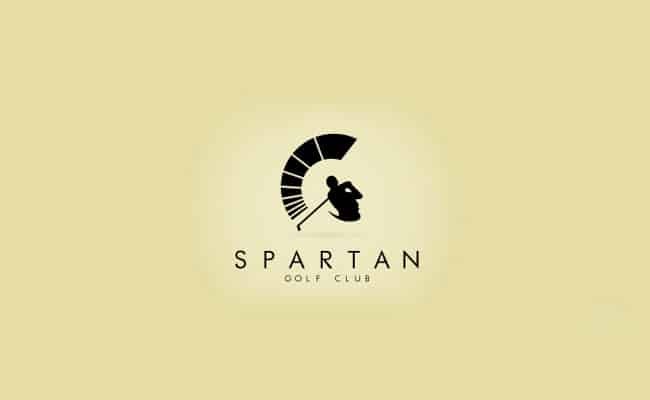
Some of the best logos out there are the ones that have an unexpected appearance, or a clever concept. One big thing is to play with negative space so that your client’s logo has a double image. This makes your logo more memorable, and recognizable. it has staying power, because the audience has to spend more time looking at it in order to see both images. testing your audience is a great way to be memorable.
It Needs to be Simple
I’ve always bee against clutter and unnecessary ornamentation, especially in a logo design. Streamlining your logo and making it more simple will make it easier for your audience to understand and digest the information. Remember, a client’s logo is going to end up everywhere. If it’s too complicated, all that complication has to be carried out on everything that your client owns. It will be on their stationary, hats, shirts, car graphics, pens, annual reports, etc. The simpler, the better. Think about the golden arches. You can spot those a mile away, and you know a McDonald’s is just up ahead.
Simplicity Leads to Flexibility
Just as I mentioned above, your client’s logo is going to be on everything. It has to be simple enough to put on everything without much trouble. More trouble means more money when it comes time for embroidering the logo on something. It’s best is it will work in one solid color, but has enough room to work with 2 colors. Your logo needs to have good contrast between the shapes and the letterforms, so there will be enough flexibility for color choices, etc.
Readability and Legibility is Key
Your font choices will make or break a logo design. Notice most logos aren’t created in handwritten fonts or script fonts. Most logos use big, bold, legible typefaces to make it easy to read. If your audience can’t read what it is, they’ll never be able to remember it. Association is key, but without identification, there can’t be any recognition. In other words, you have to know what it is in order to recognize and remember it.
Color Choices Mean Business
I mean that literally. Your color choices can help promote your business. The right colors will appeal to certain audiences. Logos are usually 2 colors. However, those 2 colors need to contrast with each other. This is super-important, because if you use too similar of a color combination, there won’t be enough contrast. Contrast means it’s easier to read and discern certain shapes and letters.
Conclusion
I’ve covered several aspects that must be considered in logo design. If you follow these simple guidelines, your logo design efforts will be much more successful. Do you have any tips for a good logo design? Feel free to leave your thoughts or questions in the comments section below.


