
How Box Shadow Works
The last couple of weeks have been devoted to showing you how different things work in CSS. A lot of people get hung up on CSS and are afraid to get started with it, but once you get going with it, it is much easier than any other previous method. Box-shadows are a nice touch when you want to bring a set of content forward in your web design work. Adding a slight touch of dimension can add an extra element to your design work, without using images to do it.
The html:
</head>

<body>

<div id="main">
<h1>Create Box Shadows</h1>
<h2>Using CSS Styles</h2>
</div>

</body>
</html>
The CSS:
body{
    background:#fff;

}
h1, h2{
    font-family:"Gill Sans", "Gill Sans MT", "Myriad Pro", "DejaVu Sans Condensed", Helvetica, Arial, sans-serif;
    text-shadow: -2px -2px 2px rgba( 0, 0, 0, .5);
    color: #eee;
    text-align:center;
    padding-top: 20px;
}
#main{
background:#fff;
height: 200px;
box-shadow: -1px 2px 5px 3px #05EDFB;
}
The Result:
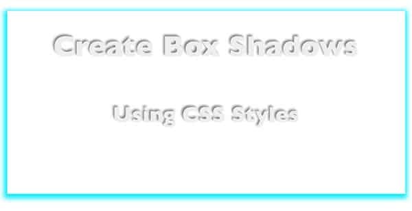
The way that box-shadow works is a lot like text-shadow, except there is one extra element. You not only have the blur setting, but you have a spread setting as well. The way it works is that the first two numbers determine how far left or right and up and down the shadow shifts from the center. Negative numbers shift the shadow left and up, and positive numbers shift it right and down.
The third number sets the spread amount, which makes the shadow thicker, while the fourth setting blurs the shadow further. These two settings combined allow you to create different styles of shadows.
Just like text-shadow, box-shadow uses both the hex value and the rgba values for color. In the example above, I used a light blue for the shadow color. The first three digits, separated by comma, determine the red, green, and blue values. The final number determines the opacity or alpha transparency of the color that you have specified.
box-shadow:-3px 3px 1px 4px rgba(0,250,0,0.8);
You can also put the box-shadow inside of the div, and this is called inset. Having an inset shadow creates a different look to your div.
The CSS
#main{
background:#fff;
height: 200px;
box-shadow: inset -1px 2px 5px 3px #05EDFB;
}
The Result:

Things to Consider
There are always things to consider when working with CSS. Keep in mind that there are certain browsers that won’t render box-shadows properly. You’ll have to use prefixes and workarounds, which I will discuss in the future. If you want to learn more about CSS, check out my CSS Guide.