Inspiring Web Design: Week 2
Everyone enjoyed the collection of web design inspiration that I shared from last week, so I am back again this week with a great collection of websites for you to visit and enjoy. If you want to see some of the best web design inspiration available on the web, just check out these websites. They are beautiful, fun, and creative. Each one of these has their own unique design style and behavior, and they all stand out from their peers and competitors. I have collected a handful of inspiring web design examples this week.
Socialites
The flat design and the color combo make this a killer website design and is inspiring and fun, too.
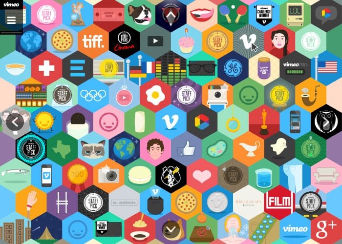
Vimeo Annual Report
The mix of colors and the hexagonal “hive” design gives the designer the opportunity to show off a lot of different icons and information. This works well for someone as diverse as Vimeo.
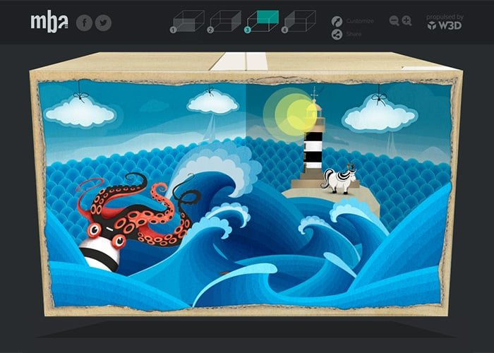
3D Greetings Box
The fact that this is illustrated is nice, but the 3dimensional quality of the site is what makes this site ahead of the crowd. It’s one thing to design in 2D, but to design and build a functional site in 3 dimensions is a feat of greatness.
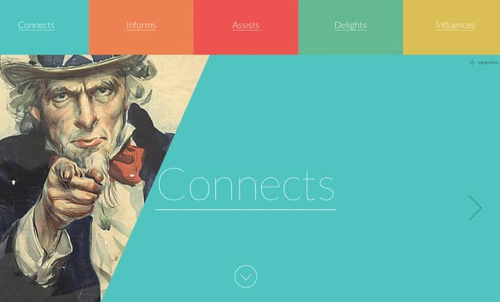
100 Years of Design
The multiple color bars at the top, combined with the aged graphic and the sharp angles make this an instant favorite for anyone. It’s so simple, yet so effective.
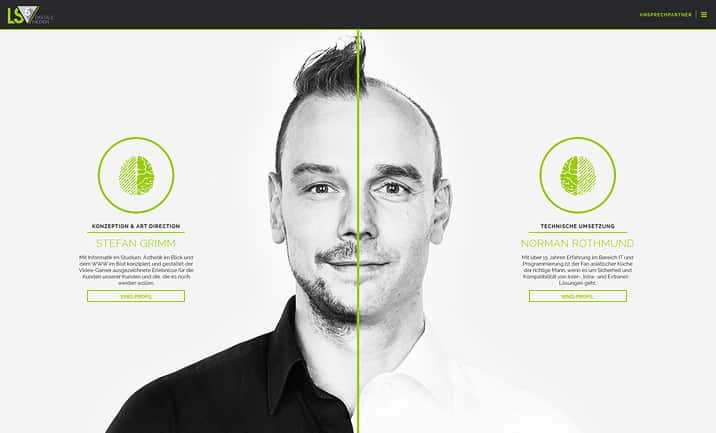
Digital Medien
White, grey, lime green and black are always an interesting color combination. Those colors mix extremely well, and create a lot of contrast.
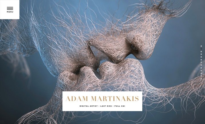
Wanda Print
The fibrous texture of this site, with the intimate image really draws the visitor into the site.
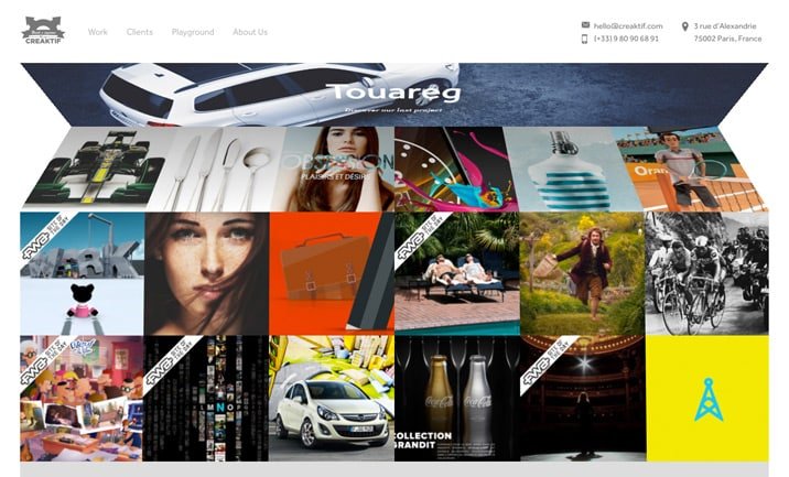
Creaktif
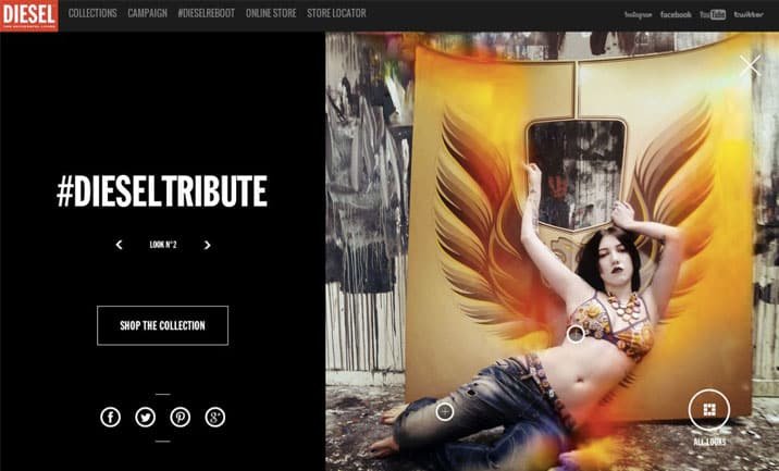
DieselTribute
So What Do You Think?
These inspiring web designs are all great examples of what creative web design should be. They are beautiful, colorful and instantly grab your attention. Each one of these inspiring web design examples look great, and work well, too. I want to hear what you have to say. Be sure to share your thoughts or questions in the comments section below.


Another great topic James. I really liked “3D Box”. As a burgeoning designer (still a student), I am developing the fondness for illustrative style. I like the faux 3d effect. It has the versatility for graphic motion. And that is exactly what they did. Kids dig this stuff; hence I like it.